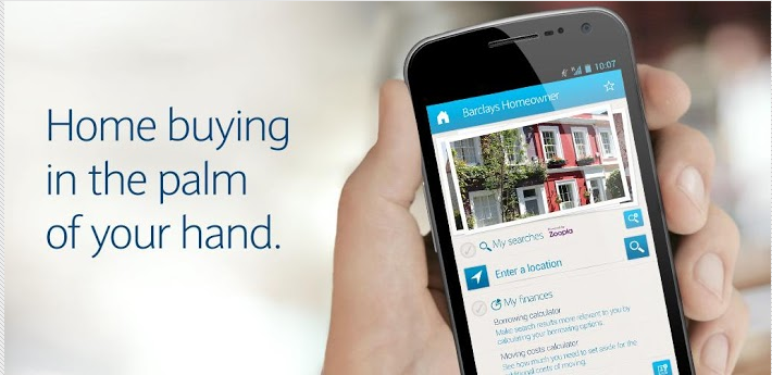
OBJECTIVE – Barclays wanted to redefine the property buying experience for their customers, from buying their house to making it a home. This would result in new mortgage leads. This was the first time a major bank considered to offer a home buying app.
This project won the Innovation in Personal Finance 2014 award by MoneyFacts Group
Barclays Homeowner App – WINNER
My Role – As the UX lead, I was responsible for designing a usable and accessible “Home Finder” app for Barclay’s potential customers on iOS and Android platforms. I was also a representative for Barclay’s “Customer’s voice” ensuring customer’s needs and expectations are being met via the app.
- Conducted field studies and competitive landscape research
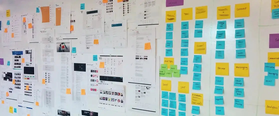
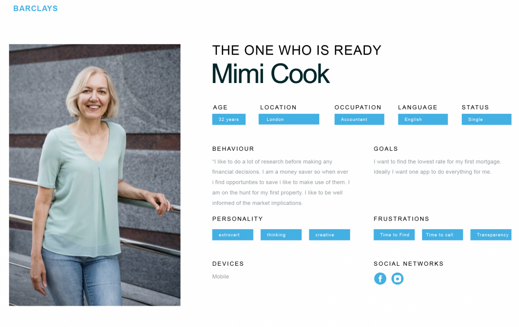
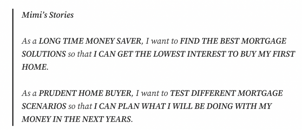
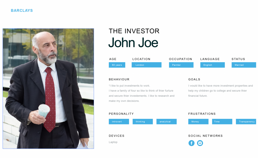
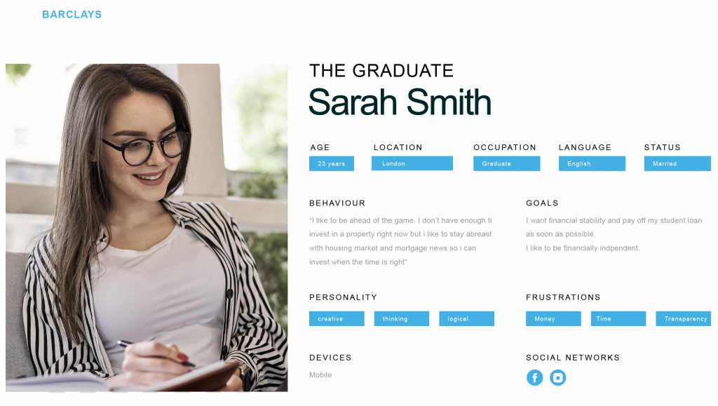
- Developed personas and customer journeys focussing on most common tasks performed by the users
- User testing with lo-fi wires
- Interaction design with Hifi prototype
- Worked closely with the scrum team and dev teams
- Tested the application with consumers who were actually shopping for mortgages
Step 1: Research
First, we recruited 16 participants who indicated that they were intending to take out a new mortgage or refinance their home within the next 6 months. We wanted to know if there were any differences in the current application’s usability based on participants’ prior experience with mortgage borrowing. So we ensured that half of the 16 participants had never before taken out a mortgage or refinanced. The other half had taken out a mortgage or refinanced at least once within the past 7 years. We also balanced each group of 8 by gender, and tried to balance participants’ ages as much as was possible.
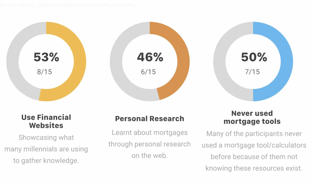
A survey research was also conducted to get a quantitate input.
Step 2: Personas and Customer Journeys
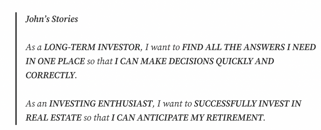
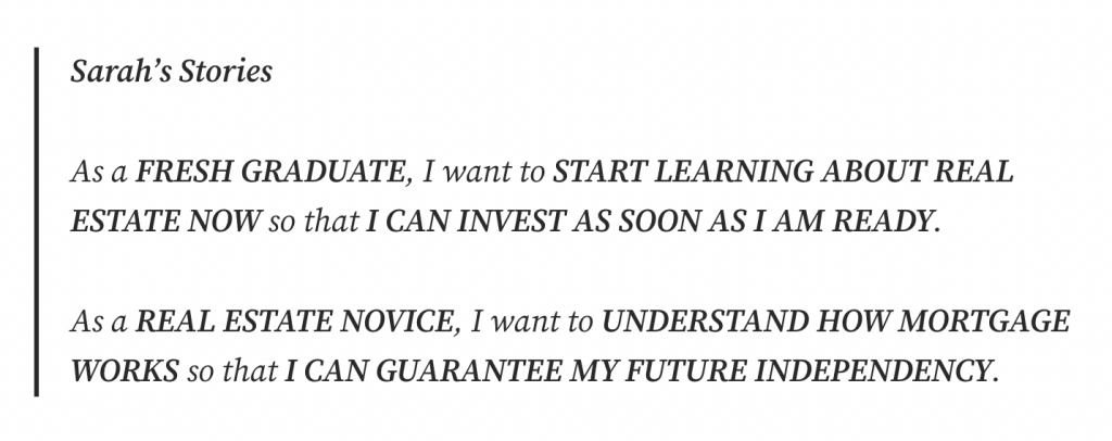
Three key personas emerged from the user research:
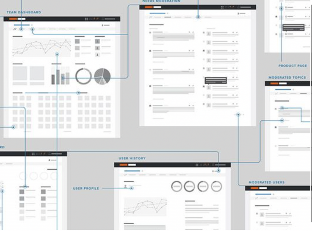
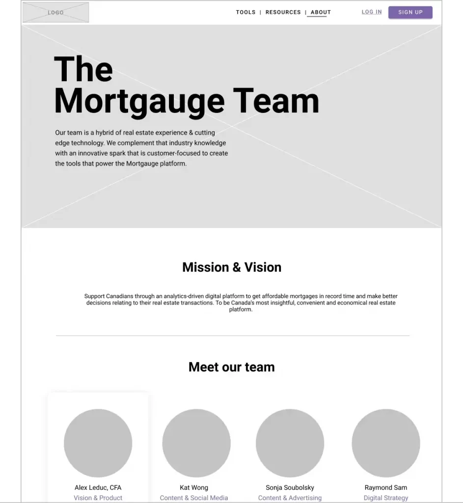
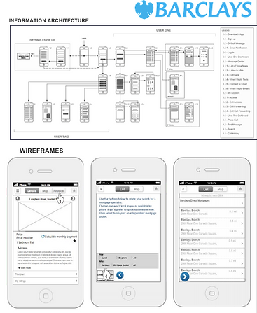
Step 3: Low-Fi Wires (Selected Screens)
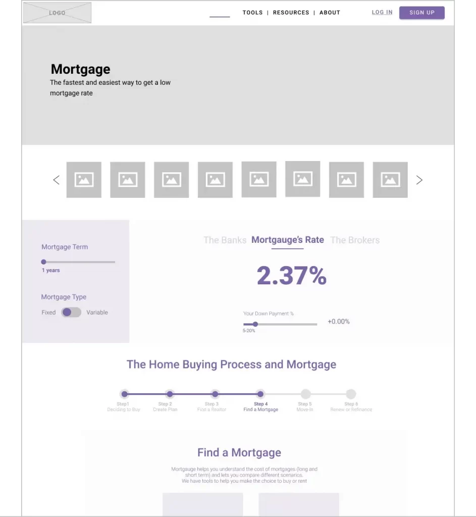
Wires were designed for desktop and mobile breakpoints. Desktop view were more focussed on mortgage experience whilst mobile focussed on finding a home.
Step 4: Usability Testing
After delivering these items we set about usability testing the new mortgage application design. We recruited 10 participants using the same criteria mentioned earlier, and assigned half the participants to the mobile view or and half to the desktop view.
A screenshot from the usability test plan.

Results – Usability Testing
Certain finance-related words and phrases were unclear to most participants. And most importantly, we discovered that participants’ expectations for what happened after they submitted their application did not match how the application process actually worked.
Step 6: HiFi Prototype
I applied all the insights gained from usability testing and applied to hifi prototype designs:
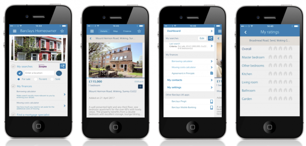
Overall, participants on desktop and mobile were able to easily find a home and complete the mortgage application using the new design prototype. Importantly, we established that participants’ expectations and understanding of the loan application process were more accurate than those of participants from the first round of testing.

