OBJECTIVE – KPMG wanted to re-design their audit dashboard and reporting system for their employees. This enabled employees to access real time information in an organized and usable way, thereby increasing efficiency. Back end support was backed by Power BI SaaS platform.
MY ROLE – As a UX Lead on the project, I was responsible for bringing user insights to the design through contextual research and user interviews. I also managed and mentored 3 UX designers and a visual designer, on different projects.
•Prepared customer research plans and conducted surveys, interviews and focus groups.
•Designed personas, mood boards and customer journeys.
•Designed low-fi wireframes and HiFi interactive prototypes.
DELIVERABLES – Personas, User Journeys, Low-Fi wires and Hi-Fi prototype.
Step 1: Research
.jpg)
Step 2: Personas and User Journeys
This Translated to 4 key user personas: :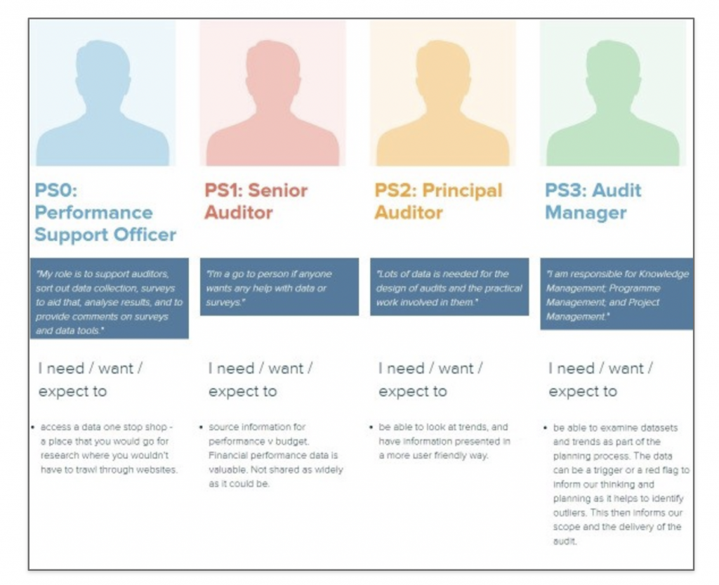
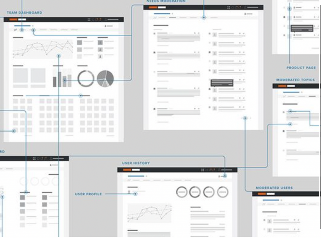
Step 3: Wireframes
(made using Figma) : Due to NDA limitations, i can not provide to the files and/or display content)

Step 4: Usability Testing
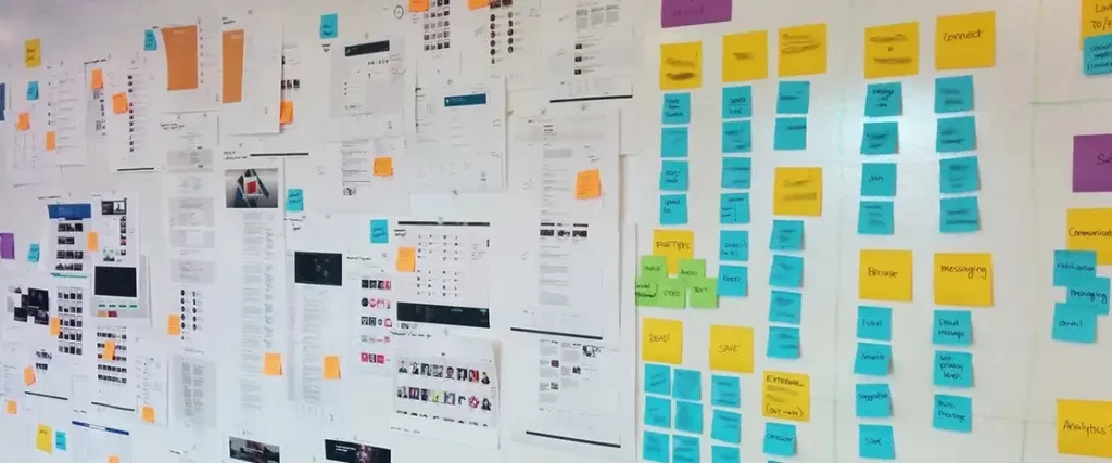
Afterwards, I printed all the screens out and try to solve the problems coming out from the usability testing.
Step 5: HiFi Prototype(Selected screens)
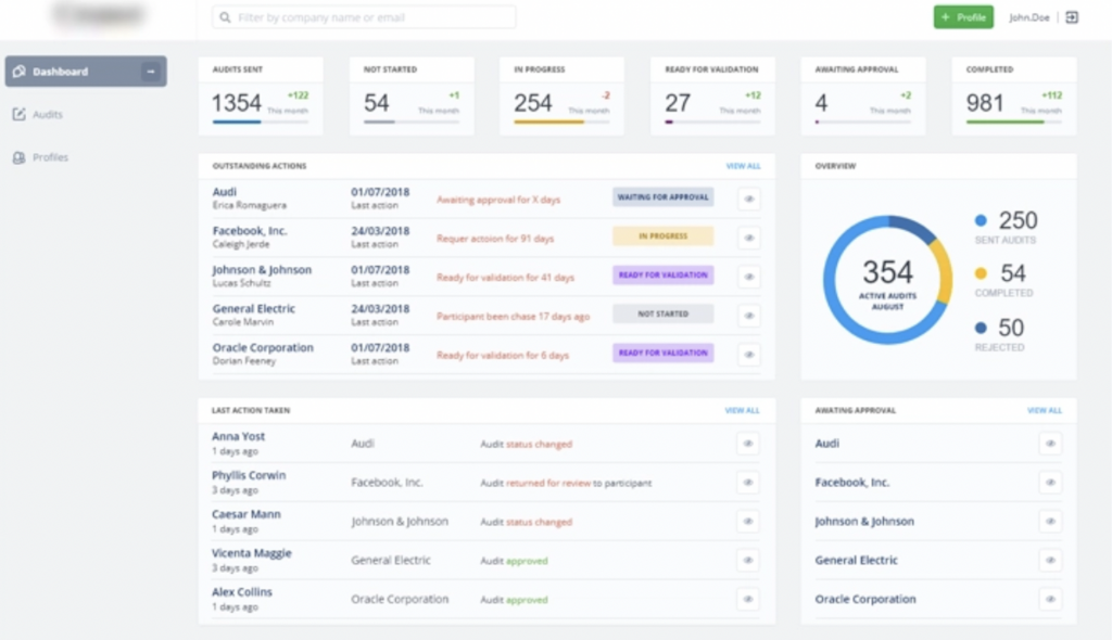
Audit Dashboard Homepage
Previous dashboard was very text heavy and users found it difficult to find relevant information and navigate through content. Navigation was streamlined and visual representations were introduced.
* content is blurred due to NDA limitations on this project.
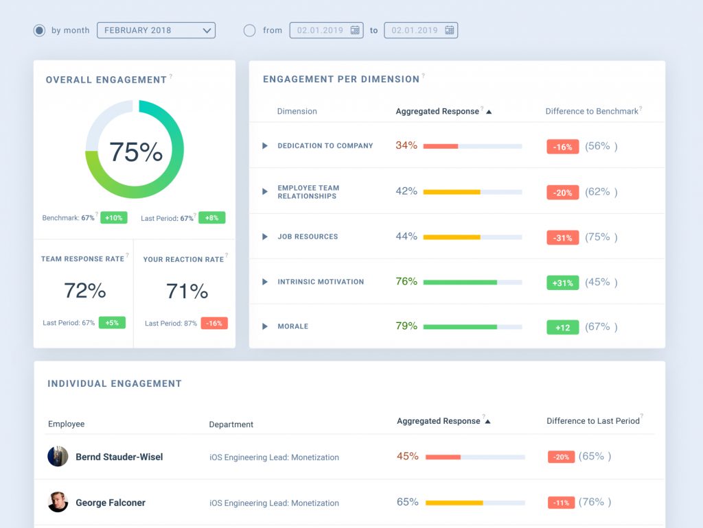
Team Dashboard
Managers wanted to track their overall team performance and measure individual engagements.
