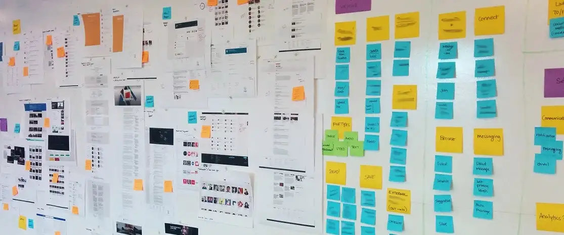
OBJECTIVE – To develop a P.O.V prototype which will enhance the onboarding experience and get people up and running with a cloud-based SaaS management app.
My Role – As the UX lead, I was responsible for bringing fresh ideas and bring them to life by employing user experience best practices:
- Conducted field studies and competitive landscape research
- Information architecture design
- Interaction design with Hifi prototype
- Worked closely with the scrum team and dev teams
- Designed usability test scripts to incorporate iterative feedback in subsequent sprints
Step 1: Research
(Limited budget was assigned by the business for research phase for this project)
Planned and conducted user interviews and ran focus groups to better understand user’s motivations. Researched competitive landscape to learn from similar experiences offered by organizations.
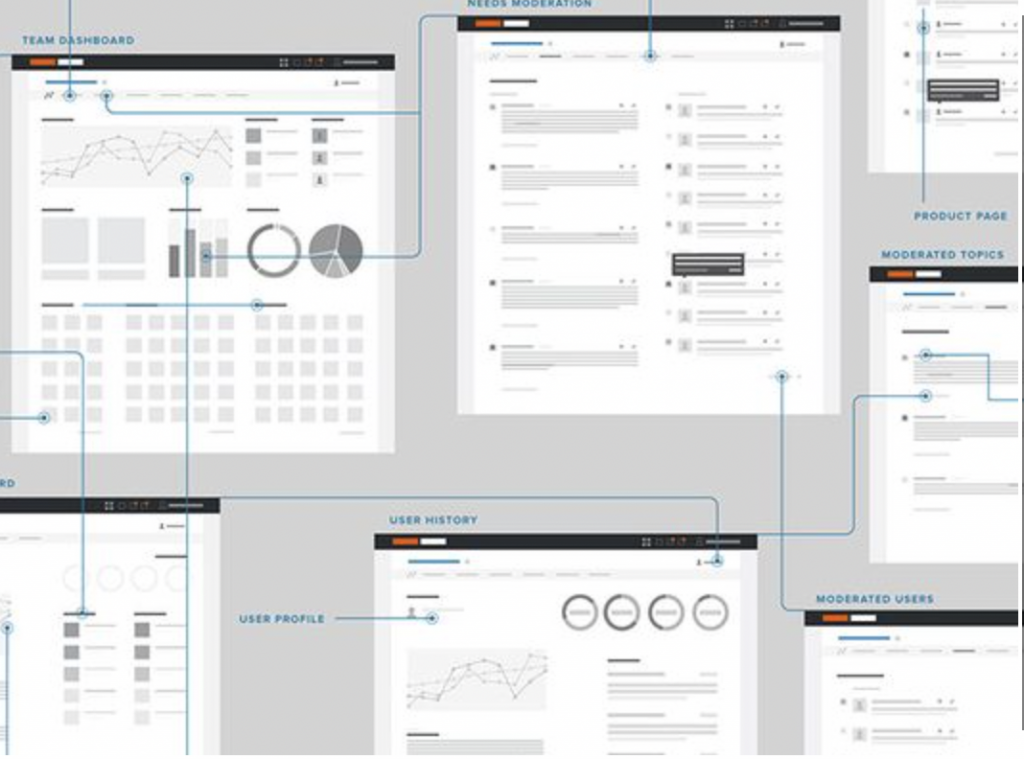
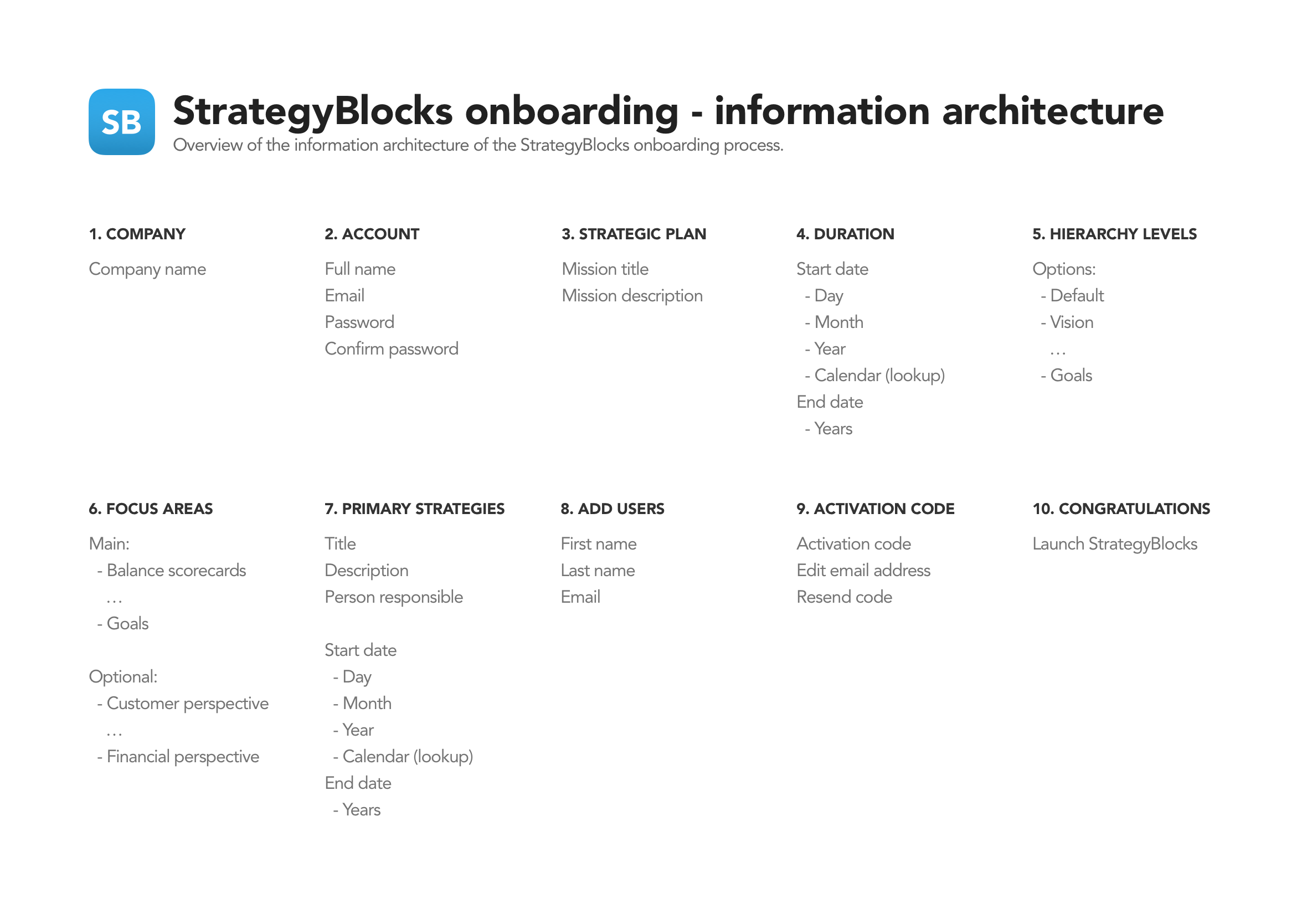
Step 2: Information Architecture
Developed a site architecture to map out exactly which screens are required and all the necessary user interface elements that make up the structure of the user flows. By having everything in the one place it made it easier to identify areas of improvements or gaps in the overall user experience.
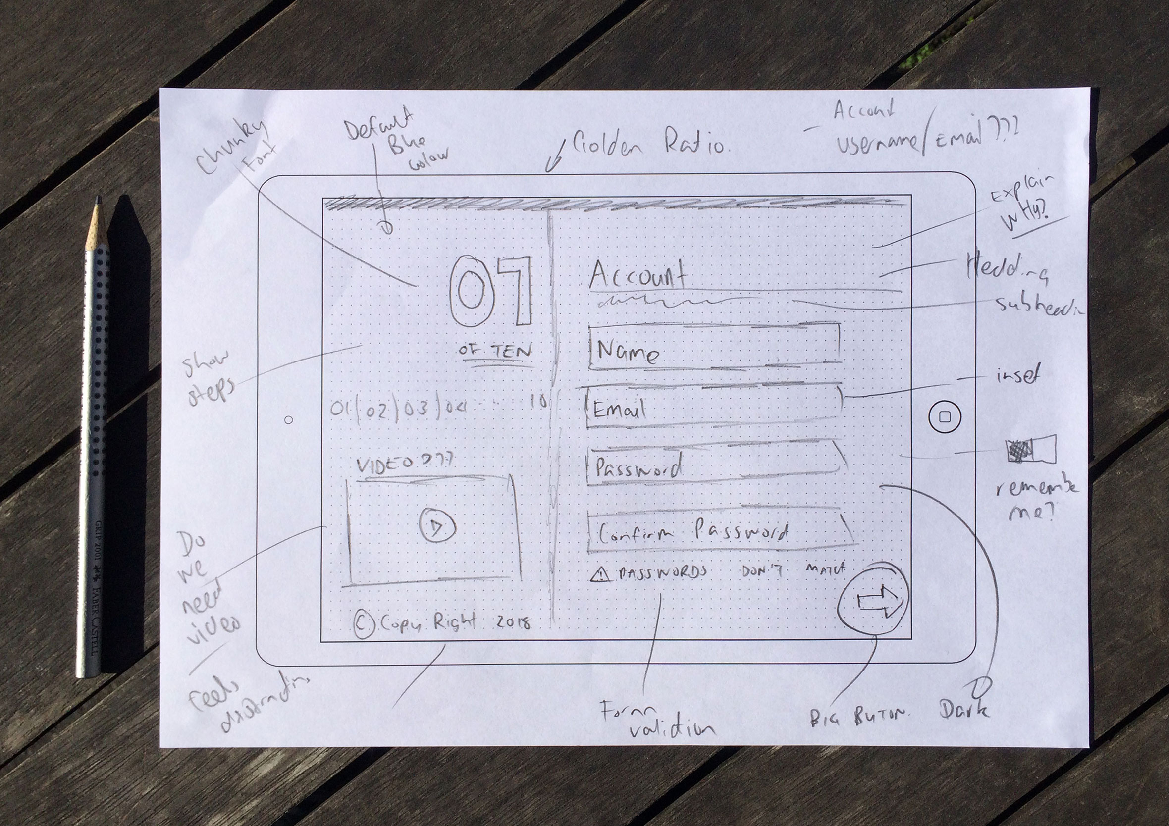
 Step 3: Sketching: Quantity vs. quality
With the information architecture and necessary screens mapped out I produced rapid sketches to experiment with potential layouts, concepts, and hierarchy. The process is to produce quantity over quality during the early stages of exploration.
Step 4: Rapid Wire-framing
Quick wireframes were created and shared with the wider group to get feedback and deepen collective understanding of the user journey. The beauty of this low-fidelity approach is to enable collaboration with the developers and work in agile way without getting caught up and wasting time on the smaller details ahead of time. While the developers are coding up the basic structure and framework I start providing them with final visuals screen by screen. 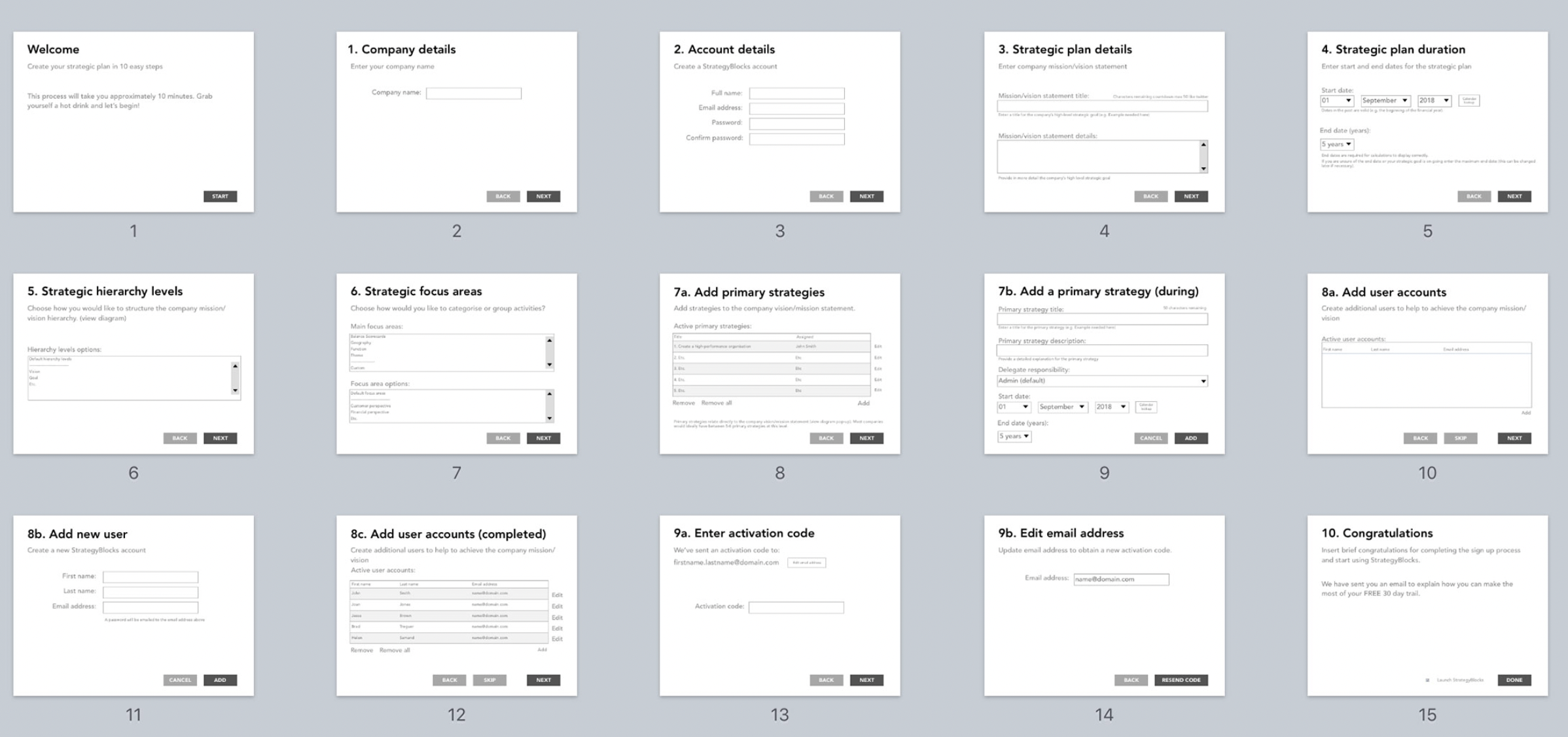
Welcome and information screen
The welcome screen tells users it’s going to take approximately 10 minutes to complete the registration process. This helps get people in the right mindset before starting the process so they can allocate the time required to get up and running.

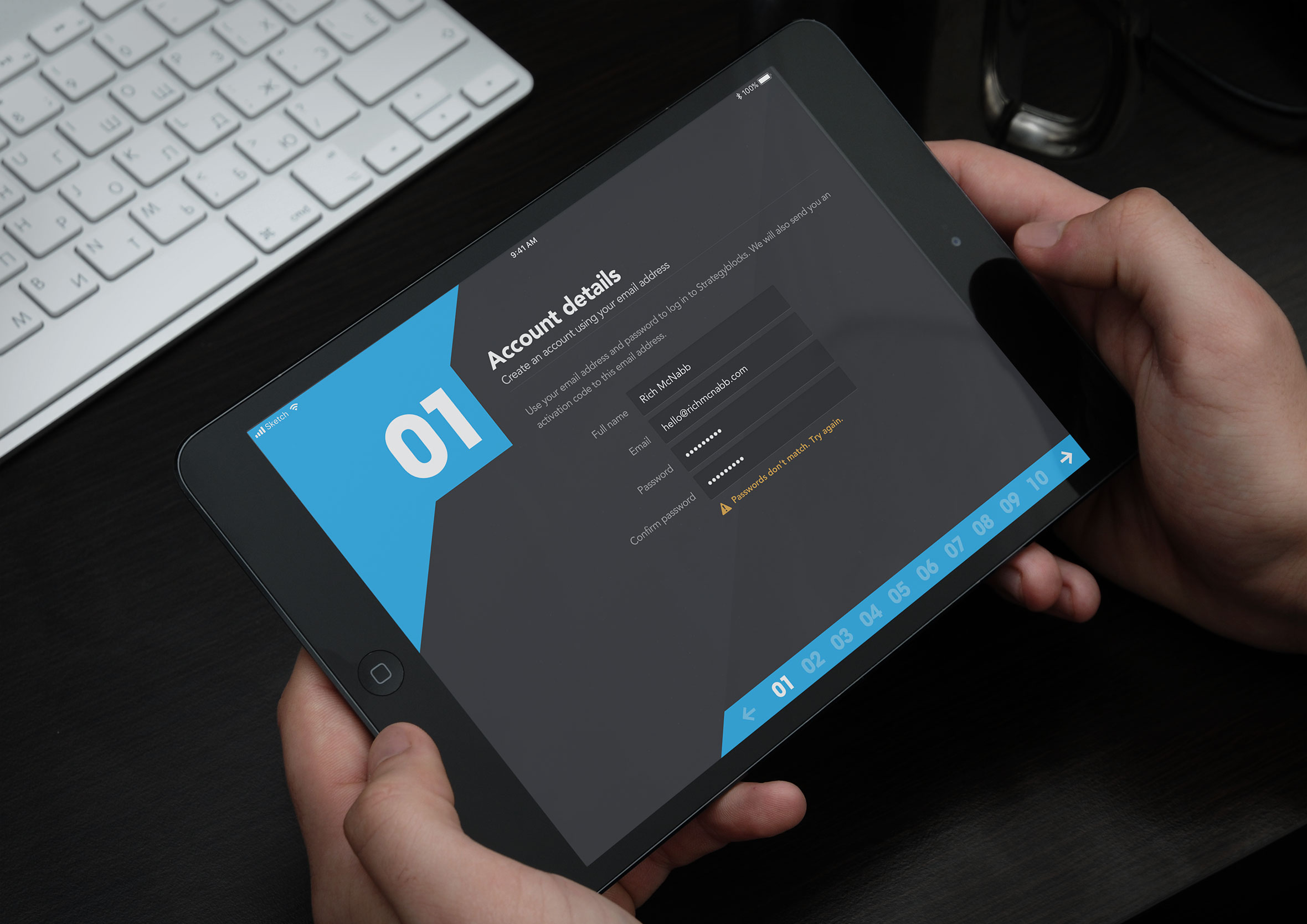
Inline form validation
The simple task of creating a new user account comes with built-in form validation to assist with the onboarding process along the way. The registration process is broken down into logical steps to help break the content and to help keep the user focused on the task at hand.

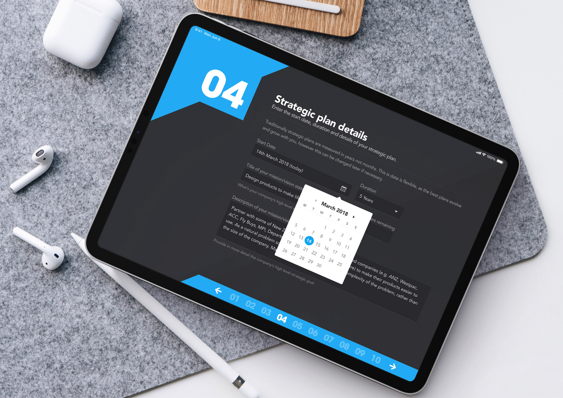
Strategic plan duration
Customized form elements to quickly select the start and end date of your strategic plan. 
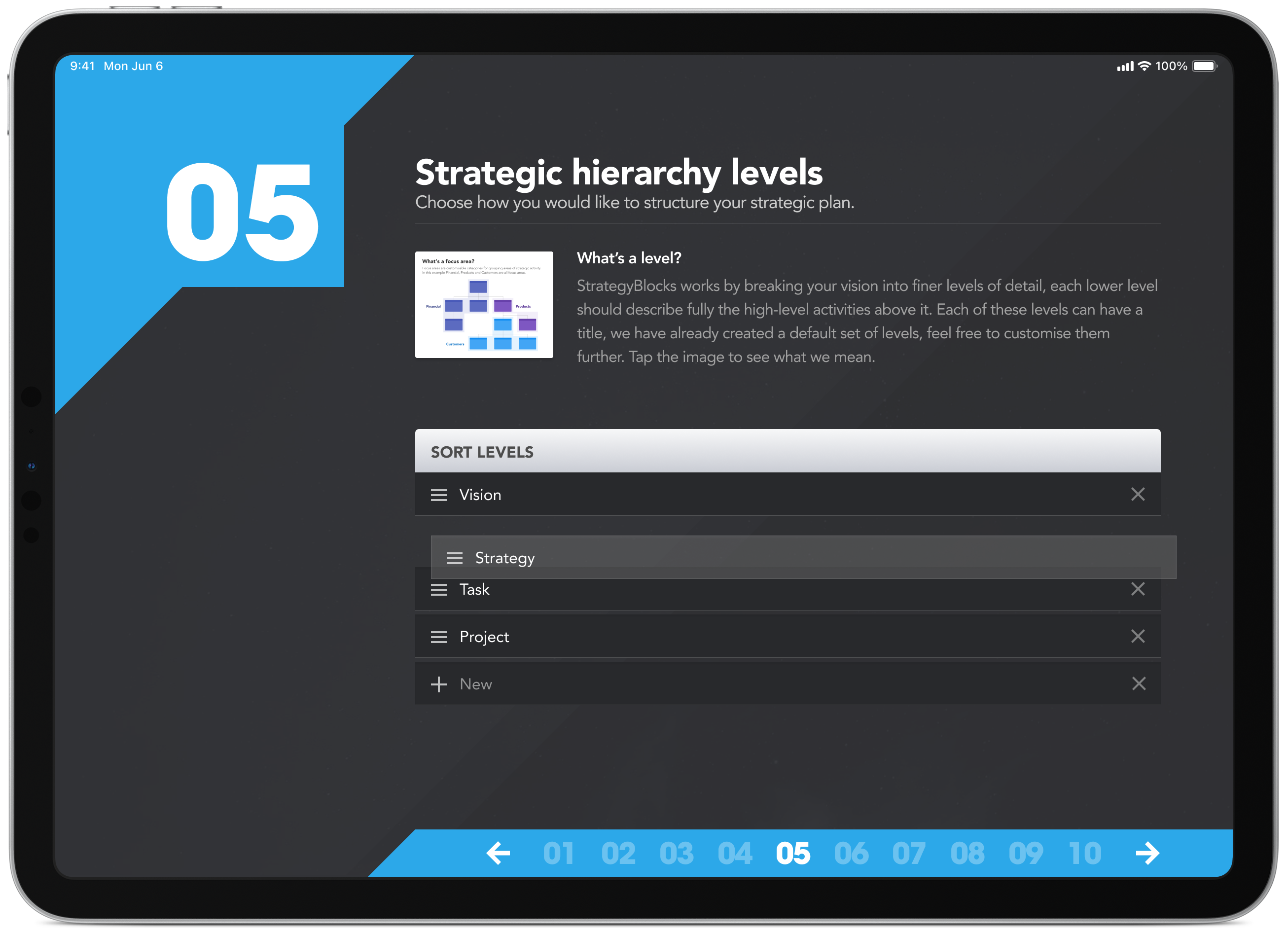
Strategic hierarchy levels
Throughout the whole process, users wanted to know exactly what was happening and why. By introducing headings, sub-headings and intro text in plain English it made it easier for people to understand why they were being asked to do a particular task at the same time providing clarity on how the product works.
Strategic hierarchy levels (pop-up)
In some cases, good copywriting wasn’t enough, we had to back it up with a diagram to further explain a more complex concept. A picture is worth a thousand words.

Social media connections
At the completion of the process, users have the option to connect and stay up-to-date with new features and improvements. It’s also a great way to encourage customer feedback an to announce upcoming features and connect with the user base.

Final design
Before going to launch I created a number of mock-ups of the app for the marketing team to use. The images were used in email, facebook, and twitter to help promote the new app and to increase early adoption numbers.
